analyzing UNIQLO sales trend with Python

Sales analysis is a way to evaluate the performance of sales by analyzing sales data. In order to improve sales effectiveness and make smart decisions, it’s important to conduct sales analysis regularly. Today, I decided to share one of the sales analysis projects for UNIQLO sales data.
About UNIQLO: Uniqlo is one of the brands in Fast Retailing, a global company that operates multiple fashion brands. UNIQLO generates about 1.9 trillion Yen in annual revenue (FY 2019) from 2200 stores globally. UNIQLO provides high quality, performance, excellent customer services, with basic casual wear at a reasonable price.
This article will include the following content:#
Description for the data;
Visualization and Insights
Dataset:#
The dataset was a .csv file that I obtained from Kesci, a website that allows anyone to practice data analysis, machine learning skills. The Dataset contains 12 columns and 22293 rows. Let’s have a preview of the data:
<class 'pandas.core.frame.DataFrame'>
RangeIndex: 22293 entries, 0 to 22292
Data columns (total 12 columns):
store_id 		22293 non-null int64
city 			22293 	non-null object
channel			22293 	non-null object
gender_group	22293 	non-null object
age_group		22293 	non-null object
wkd_ind			22293 	non-null object
product			22293 	non-null object
customer		22293	non-null int64
revenue 		22293 	non-null float64
order 			22293 	non-null int64
quant 			22293 	non-null int64
unit_cost 		22293 	non-null int64

dtypes: float64(1), int64(5), object(6)
memory usage: 2.0+ MB
At the first glance, the data contains information for each store’s sales data, such as store ID, city, number of customers, revenue, etc. My initial questions were:
❓Not entirely sure what does quant mean. Does is refer to the number of products purchased by each customer or by all customer?
❓The data doesn’t include specific dates, so it’s difficult to predict overall trend or build statistical model to predict future sales.
Questions:#
Because of the limitation of the dataset, I decided to list some questions/insights that I can generate from this dataset:
🤔How many unique cities in total? Which city/store contributes to more revenue?
🤔How many types of products? What is the top 5 best selling product?
🤔Does female or male contribute more revenue?
After listing the goals, I imported data and visualized them. After exploring them further, I concluded there are no missing values. There are few “unknown” data in the gender group column. Since the amount of missing values are very small, I didn’t do anything about them.
1. How many unique cities in total? Which city/store contributes to more revenue?
#10 unique cities total
data.city.unique()

output:
array(['Shenzhen', 'Hangzhou', 'Wuhan', 'Beijing', 'Chongqing', '
Xian', 'Guangzhou', 'Nanjing', 'Shanghai', 'Chengdu'], dtype=object)
city_store=data.groupby('city')['store_id'].nunique().reset_index()
city_store

output:
  city    # of stores
0 Beijing 	1
1 Chengdu 	5
2 Chongqing 6
3 Guangzhou 6
4 Hangzhou 	11
5 Nanjing 	1
6 Shanghai 	6
7 Shenzhen 	11
8 Wuhan 	11
9 Xian 		6
As we can see from the data, there are 10 distinct cities. The “unique()” method allows us to see unique values in a column. Using groupby() and nunique() methods, we can see the number of stores in each city. nunique() allows us to count the distinct number of store_id. With the Seaborn package, we can easily visualize that the dataset contains more stores in Hangzhou, Shanghai and Wuhan than any other cities:

After visualizing this information, I hypothesized that those three cities should contribute most in terms of revenue.
plt.figure(figsize=(15, 8))
sns.barplot(x='city', y='revenue',data=city_revenue,
palette='Paired',estimator=sum) plt.tick_params(labelsize=10)
plt.xlabel('City', fontsize=20) plt.ylabel('Revenue', fontsize=20)
 This graph validated my hypothesis. Hangzhou, Shenzhen and Wuhan did indeed generate more revenue compared to other cities. However, the dataset contains 11 stores in Shenzhen, it’s unfair to compare the total revenue to Beijing which only had one store. Therefore, I decided to visualize each store’s sales performance:
plt.figure(figsize=(20, 8))
sns.barplot(x='store_id', y='revenue', hue='city',data=city_revenue,
palette='Paired',estimator=sum) plt.tick_params(labelsize=10)
plt.xlabel('City', fontsize=20) plt.ylabel('Revenue', fontsize=20)
 Again, with Seaborn I plotted the bar plot with each store as x-axis and total revenue as y-axis, and use city to show different color(hue). As shown above, one specific store in Beijing had the highest revenue compared to other stores.
2. How many types of products? What is the top 5 best selling product?
Next, I am interested to see the top 5 selling products in these stores. Still, the groupby and aggregation function allows us to see this information easily:
data['product'].unique()

output:
array(['Seasonal New Items', 'Fitness Products', 'UT(T-shirts)',
	'Socks','Shorts', 'Jeans', 'Sweater', 'Accessories', 'Dress'], dtype=object)
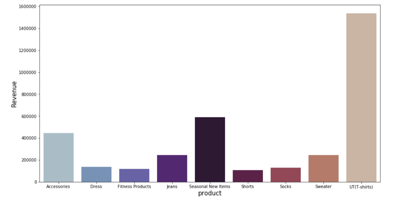
r_products=data.groupby(["product"]).agg({"revenue":sum}).reset_index()
r_products

output:
product			Revenue
Accessories 		444685.15
Dress 				137302.78
Fitness Products	118059.68
Jeans				246127.48
Seasonal New Items	590664.88
Shorts 				107485.88
Socks				127731.36
Sweater 			245630.80
UT(T-shirts)		1538744.84
plt.figure(figsize=(15,8))
sns.barplot(x='product',y='revenue', data=r_products,palette="twilight") plt.tick_params(labelsize=10)
plt.xlabel('product',fontsize=15)
plt.ylabel('Revenue',fontsize=15)

I used bar plot to show the revenue by each product type. As we can see, T-shirts have the highest revenue, followed by seasonal new item. As someone who is familiar with UNIQLO brand, short sleeves t-shirts and graphic t-shirts have always been the most popular item. UNIQLO is also famous for its ultra-light down and the HEATTECH series. However, this particular dataset doesn’t contain those product types.
 As I know, UNIQLO provides limited edition collections and collaborations every year, this product line is especially popular with young customers. Last year, KAWS X Uniqlo COLLECTION were so popular that it even caused some chaos in UNIQLO stores. Therefore, store managers as well as sales associates should always be aware of the store inventory and plan out effective strategies for selling popular products as well as least sold products. For example, the store could provide promotions “20% off on the total purchase if the entire purchase contain any accessories” in order to get rid of the stranded items. Other strategies can include changing product display or advisement display.
3. Does female vs male contribute more revenue?
Let’s first see the number of female customers versus male customers. By using value_counts function, we are able to see this information easily:
gender_count=data['gender_group'].value_counts()
gender_count

output:
Female    14208
Male       7967
Unkown      118
Name: gender_group, dtype: int64
As shown above, there are 63% of the customers are female. The data also contains very small amount of “unknown” data (0.5%).
Now, in order to target our customers better, I am interested to see which gender group prefer which product. Did female group buy dress more than any other products? Did male customers purchase more t-shirts?
plt.figure(figsize=(8,4))
ax = sns.countplot(y='product', hue='gender_group',
data=data, order=data['product'].value_counts().index,palette="Blues")
plt.tick_params(labelsize=12)
plt.xlabel('customer',fontsize=15)
plt.ylabel('product',fontsize=15) plt.show()

In order to see the number of customers, I used countplot to count the number of customers in different gender group. As shown above, there were way more female customers than male in every product category such as dress, jeans and accessories. The only category that male came close to female purchase would be shorts.
Overall, the dataset indicates that T-shirts are the best-selling products at UNIQLO. The top 5 selling products are T-shirts, Seasonal New Items, Accessories, Jeans and Sweaters. Therefore, the marketing team should use promotion and marketing strategies to avoid inventory shortage and the inventory that are not sold very well. Also, there is definitely a different shopping preference between genders. Overall, UNIQLO have more female customers than male customers. Despite the gender difference, T-shirts are still the best selling product across both genders. Among all of the customers who purchased shorts, around half of them are female, half of them are male. However, there are 3 times more female customers than male customers who bought dresses. The sales team should notice the difference, display the products accordingly based on promotion, seasonal needs and gender preference.

Lastly, I believe the data could be formed in a better way. It can be split to different tables: a store data table, a sales data table and customer information table to make it easier to interpret.
(Originally written on wix.com Jul 25 2020)